

When I visited Karen Mainenti’s Brooklyn studio earlier this year, the first thing that caught my eye in her jewel-box workspace was the toilet paper.
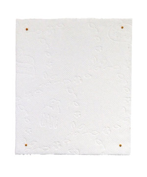
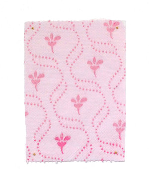
Pinned into place, like rare specimens of delicate fabric, framed under glass, and mounted on the wall were 25 squares of TP that Karen has collected from around the world. Entitled "Works on (Toilet) Paper," the collection exemplifies what I love about Karen's work: the combination of exquisite beauty and sly humor that seduces you into reconsidering the conventions of femininity — and misogyny — in the ordinary objects, accessories, and images that surround us.
The material culture of toilet paper is just one facet of Karen's prolific output of painting, collage, and sculpture. While her various projects are diverse, her work coalesces around the central theme of feminine sexuality: the ways in which our culture and economy both productizes sexuality and sexualizes commercial products, particularly domestic products. I knew instantly she would be a great fit for the Society for Domestic Museology.


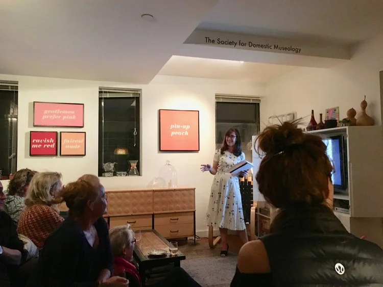

For her exhibition entitled, Cosmetology, which opened in November 2016, Karen hung examples from five ongoing series of work: Product Placement, a series of vintage pin-up shots of women with images of consumer products obscuring their naughty bits; Cooked Books, hand-colored images from vintage cookbooks; Color Me Beautiful, paintings of lipstick colors and their provocative names; Packaged Curves, new work she is doing in cast porcelain, and the aforementioned Works on (Toilet) Paper.
For the opening evening, we paired the work with appropriately vintage food, a nod to the Cooked Books series: deviled eggs, stuffed mushrooms, meatballs, all staples of the mid-century dinner party.
Karen began her discussion with the definition of the term cosmetology: the professional practice of beautifying the face, hair, and skin. It derives from the Greek kosmetikos, which can be traced back to the word kosmein, meaning "to arrange or adorn."

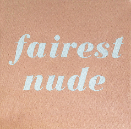
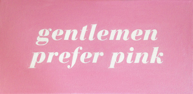
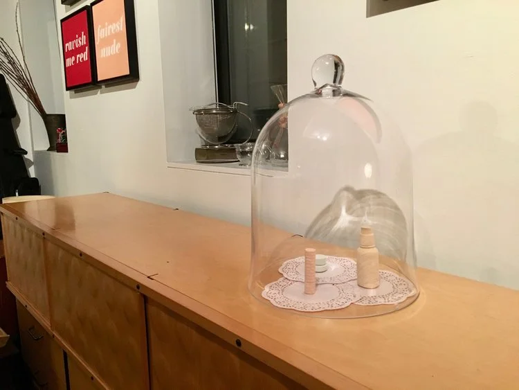
She then led us through a slideshow detailing the inspiration and process for each of her series of work, beginning with the Color Me Beautiful paintings on our living room wall. The title is a playful reference to the book of the same name that came out in 1987 (my mom had a copy, and I remembering reading it and discovering that I was a "Winter"). The four paintings on canvas are carefully stenciled with the familiar yet ridiculous names of common lipstick shades against a saturated backdrop of the color they represent. Encased in a black frame, the images evoke giant make-up compacts. Drawing upon mid-century magazine ads for lipstick and inspired by the work of Robert Indiana, the bold color and evocative typography draw attention to the absurdity and insinuation in each shade of lipstick. Some of them, like the rather rape-y Ravish Me Red, have been around for decades. Women, myself included, buy and wear these colors, maybe smirking at their campy names or likely not even noticing them at all. But, as Karen points out, the tacit acceptance of this not-so-subtle sexism also says something about how women often see themselves.


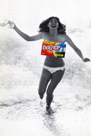
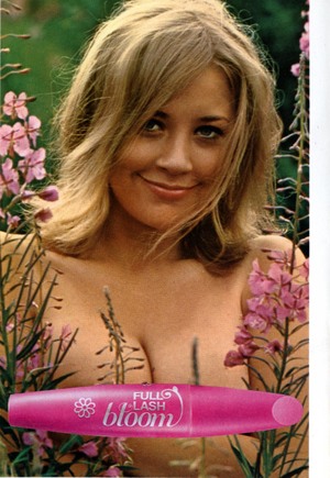
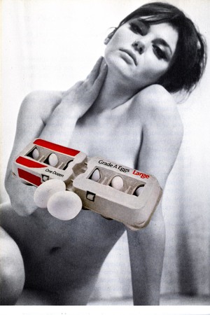
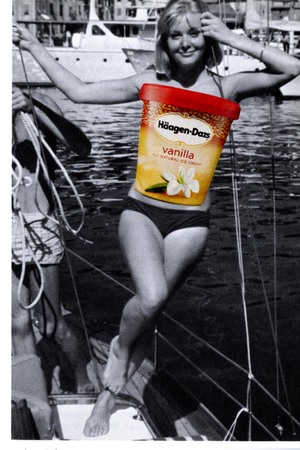
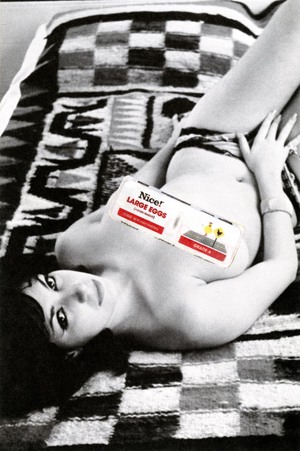
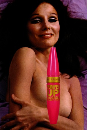
Product Placement has the same combination of ironic humor and devastating commentary. How can you not laugh at the ridiculous image of a lounging nude woman with her ass obscured by a Hershey bar? But the apparent juxtaposition is only a slight exaggeration of actual advertisements that sexualize food and other products.
Recalling the work of Laurie Simmons, Ellen Gallagher and Linder Sterling, who have also juxtaposed and recontextualized the ephemera of popular culture, Karen's pin-ups are both hilarious and alarming. The way she plays with scale, enlarging the product images to body size, gives the collages a surreal quality.


In our hallway, Karen hung a quartet from the toilet paper series, each with a different pattern (lambs, floral) that undeniably suggests "feminine." Why? What is particularly feminine about toilet paper, an item used nearly universally? (Though one guest pointed out that in some countries, toilet paper is a luxury item, which would help to explain why some of the most ornate squares came from some of the poorest countries). Is it that we take the connection between women and hygiene for granted? That which is intimate and domestic must automatically take on the visual cues of the feminine? The point isn't to answer these questions, necessarily, but to look more closely at the design of objects with which we are intimately familiar but don't truly see.


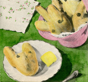
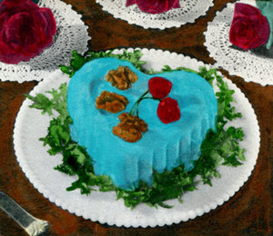
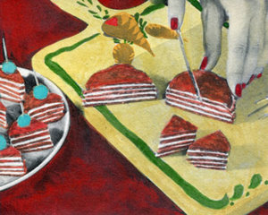
Next to the works on (Toilet) Paper, hangs another grouping of small, framed pantings entitled, Cooked Books. Taking black and white images from vintage Betty Crocker cookbooks and painstakingly coloring them with water color, using the same garish color schemes that were popular in that era. The time consuming, labor-intensive process of coloring these images parallels the time-consuming recipes they illustrate. After working for many years at Martha Stewart Living, much of Karen's work — and especially this series — is a meditation on the cult of domesticity. As she showed slides of food advertisements spanning the last 60 years, our discussion turned to the moments in history where high domesticity reigned: post-war United States as a way to bring working women back into the kitchen when they were no longer wanted in the labor force, the late 1990's and early 2000's as a backlash to the increase in working women again in the 80's. The proliferation of glossy magazines like Martha Stewart Living made complicated meals look not only easy, but somehow required, all along reinforcing the accepted norms of femininity and sexuality. Karen compared these earlier images to the prevalent food styling of today, trying to parse out the subtext in what seems less overtly gendered, but is it? In her presentation, Karen also placed this work in the context of other artists who use food as their subject: Wayne Theibaud's cakes and Julia Jacquette's witty food series. Having Ms. Jacquette as a guest that evening was serendipitous good fortune.
The last series we discussed was Karen't most recent. Having recently learned how to work with ceramic and plaster casting, this series of small sculptures are replicas of make-up cases. By stripping them down to their bare shapes, devoid of color and marketing, the viewer is asked to consider what the shapes themselves convey. There are certain containers that need only their shape to communicate what they are for: lipstick, for instance, or most dish soap. Is the latter's exaggerated feminine shape merely ergonomic? Or is it meant to evoke a woman's body? Does Feminine equal clean? Or just cleaning.
When approaching gender and femininity through art you have to tread carefully, lest the art be drowned out by the rhetoric. But Karen uses humor to draw you into a space where the point is made. The commodification and objectification of women is something that is particularly relevant right now, and in the wake of our election has been made visible. Having a President-elect who was in the business of beauty pageants and whose vision of "making America great again" harkens back to the days of lipstick, pinups and jello molds, makes this work all the more meaningful.
The context of Domestic Museology — that is, hanging this work in our home — gives it another layer of meaning. A few days later, while unpacking groceries, it seemed I was examining every detail of our household products, from the toothpaste to the toilet paper, thinking of all of the design decisions encapsulate in each one and looking for the subtext. While sometimes a coupon is just a coupon, sometimes it is something else entirely.